These days, landing pages are very popular in online marketing, and for every event or marketing campaign, you will see a landing page. A landing page developed with the best landing page practices can help you achieve your objectives easily.
I hope that even if you are new to this, you must have heard of it. If not, don’t worry; this blog post will outline everything about landing pages and how to optimize them using best practices.
In this blog post I will cover:
- What is a landing page?
- How is a landing page different from other pages?
- Are landing pages important for a business?
- How do I optimize landing pages for better conversion?
Making excellent and high-converting landing pages isn’t difficult, though it requires some smart effort. A good landing page will amaze your customers and give them what they need.
So, let us start with the big question:
What is a Landing Page?
A landing page is the first page your visitors land on from an external source or through a sales funnel.
A landing page can be your home page, a product page, a blog post, or a lead capture page, etc. A landing page is a standalone web page, it is separated from the website’s navigation.
However, in online content marketing, a landing page is specifically designed to convert visitors into leads or customers.
The objective of a landing page is to convince a visitor to either buy, sign up, or download an eBook.
The Definition of a Landing page by Unbounce

Landing pages are designed with a single goal or Call-to-action (CTA).
Benefits of a Landing Page
I have often clicked on an ad but when I landed on the landing page, I did not purchase as the landing page did not show what I expected. It did not hold the right information or it was confusing.
bad landing page can negatively affect your business, while a good landing page can take your brand to the next level. Here are some benefits of good landing pages:
- Support Your Business Goals: A good landing page allows your business to reach new customers and increase sales. Landing pages also encourage visitors to sign up for your mailing list or subscribe to your newsletter or ask for a consultation.
- Getting an SEO Ranking: Although the landing page may not always help you rank high, if you follow the right SEO strategy with the right landing page best practices and provide the best experience, it will rank high on the Google search page.
- Smooth Buying Experience: One purpose of a high converting landing page is to move visitors through the sales funnel seamlessly. Visitors must get complete information from your landing page, and should know what to expect after clicking the buy button. This will provide them with a smooth buying experience. For example, you can say click the buy now button, enter your payment information and email ID, and get the eBook delivered to your email.
- Helps Aid Data-Driven Decisions: Landing pages could be linked to a specific campaign. You can see which channels generate the most leads, conversions, and the best performing campaigns. The results from tracking user behaviors are useful for making better decisions, reaching a target audience with the right message and strategy.
- Increases Credibility: The focus of landing pages is on a singular task. You can optimize your page content for a single CTA. A professionally designed and well-optimized landing page provides the best user experience, customers will appreciate it, and your brand recognition and credibility will increase.
- It works 24X7: This is one benefit that all online businesses love. When you develop a landing page and connect it with your sales funnel, it makes money on autopilot on 24X7 with no intervention from your side.
How a Landing Page is Different from Other Pages
A website has many pages such as “Home” pages, “About” pages, and “Contact Us”, but they may or may not be classified as landing pages.
You may design these pages using a landing page builder and use some best landing page practices to get desired results, but they are not a true landing page unless they have a specific goal.
Many marketers don’t consider these pages as landing pages. The reason is obvious.
For example, the Home page is usually not designed with a single call to action (CTA). Its central purpose is to introduce a visitor to the brand and show off the content they could access.
The Home page would definitely look excellent, contain information about the company, their values, and range of products. But they might not have a product buy link. This page also offers several navigation paths for visitors and does not specifically have a CTA.
Home pages can have a subscription form but conversion is not the sole purpose of the home page; the form is just a page element.
Likewise, an About page usually does not have any specific call to action.
However, the landing page is super focused and has one goal that leads to conversion. It prevents visitors from being carried away from any other call to action.
Elements of Landing Pages
According to Unbounce, a landing page has five elements:
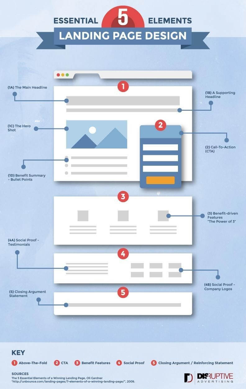
1. Above-the-Fold Content
The term “Above the fold” came from the newspaper industry, and in online marketing, it is the content in approximately the first 600 pixels of the landing page.
As it is the first content that users see, and you must make it compelling to capture customer attention.
Here are some sections in the Above-the-fold content:
1. The Main Headline
A headline is the first thing your visitors will see. The headline is where interest begins. The headline must be short, grab the attention of the reader, and communicate the product or service.
Your headline should effectively convey the message. Selling a product would carry a different overview from signing up for your email list.
For example, when you run a deep cleaning agency and want people to pay for your service, you might use the headline “Make your home clean today!” But, if your goal is to make people sign up for your email list, “Learn more about deep cleaning” would be a better option.
2. Sub-Headline
Sometimes, you need a sub-headline to support headlines and generate more interest. Ideally, the headline should hold enough information to compel potential customers to take action.
But it is not always the case, and you would need an additional push for a conversion. The main headline could contain the essential information that your potential customers would need.
However, your supporting headline would contain more information that makes the main headline more compelling. It is not a must for every landing page to have a supporting headline.
But when the supporting headline is crafted excellently, it could generate more conversion.
3. Hero Shot
Headlines and subtitles have a few words only. Sometimes, it could be challenging to create an emotional response with these two sentences.
Therefore, a picture needs to be added, as it communicates a thousand words. The hero shot is as important as your headline.
Your hero shot carries your landing page’s aesthetic as people get to know they are on the right page. The image must be compelling and support the headline.
Back to our example of a deep cleaning agency: a hero shot of books would not be appropriate to drive conversions. Instead, clothes and washing machines would be a suitable hero shot here.
This example gives a clear highlight of the importance of your hero shot. The hero shot can either make or break your headline.
4. Benefits Summary
It is not necessary to include this section in the fold. The essence of the benefits summary is to quickly summarize all benefits above the fold.
2. Call to Action (CTA)
The CTA is what you want the readers to do. It is the most critical element of your landing page.
When you decide to create your CTA, you need to determine what visitors should do on your landing page. This step is vital; else, you could end with several CTA and dilute its effect.
Here is an example of a CTA on Neil Patel’s landing page:
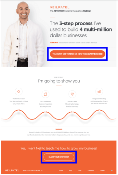
Neil Patel’s CTA is simple, user friendly, and consistent throughout the page. This page explains that you are in the right place to grow your business and a click away from making that decision.
Most readers do not have much time to read through all pages. So, make the selection process easier and solve a lot of problems.
Some examples of great CTAs are “Get Started Now,” “Contact Us Now,” and “Add to Cart.” However, to these CTAs, you can add offers or benefits that boost conversion. The customers should feel they are getting something in return; they should feel the value they get in exchange for their choice.
Many marketers go further with some tricks to have a CTA like “Contact Us Today for 10% Off”.
I don’t recommend you do these kinds of tricks. Although these tricks may increase your conversion, they somewhat affect your credibility and morality because every time they land on your page they see the same offer.
Finally, you need to pay attention to the color of the CTA. The color must stand out from the rest of the landing page and be placed prominently in a strategic place.
3. Let Visitors See the Benefits
If someone gets to your landing page, you have to make sure they continue to read the page until they make a decision. At this point, your readers will be curious to know what they stand to benefit from it.
Many marketers spend time talking about the business and how they developed the product. Don’t do that. Visitors do not care about your effort, they only care about how the product will solve their problem.
4. Social Proof
Social proof can help your potential customers trust your brand and product. Testimonials, especially from reputable sources or authorities, work better to convert visitors to buyers. You can also have third-party testimonials and proof.
5. Closing Statement
A good landing page should show customers that the choice they are making is in their best interest.
Throughout the landing page, you should address their specific needs and explain the value they would get from making a choice.
You should summarize everything you have written from the top of the landing page to the base and then add any additional selling points you think would seal the deal.
Types of Landing Pages
Marketers use the following types of landing pages:
- Click-Through Landing Pages: These are the most common types of landing pages. The purpose is to provide visitors the information they need to buy the product. This page explains the merits and then lets visitors go through the sales funnel.
- Lead Capture Landing Page: This could also be called squeeze pages, and the central aim of this page is to collect the emails of visitors for marketing purposes. These lead capture pages don’t have any exit paths; there are no internal or external links except the CTA for visitors to submit their details.
- Viral Landing Pages: This landing page is used by businesses to promote their brand through word-of-mouth marketing. This page aims not to increase sign up alone, but to ensure they share the word with their friends, families, and colleagues. For this page, social icons are attached to make the sharing process hitch-free.
- Unsubscribe Landing Pages: This page is different from others in functionality, as it assures customers that they have unsubscribed from one of your services. You can use these landing pages to your advantage by allowing customers to subscribe again, manage their preferences, and prompt them to explore your site once again.
- Long-Form Sales Landing Page: Sometimes, you need to give detailed information that potential clients need. This page helps you address and answer any questions you foresee, communicate the products’ benefits, and provide a thorough walk-through of the products and services you offer. Since these pages are heavy in content, they can help you get higher in Google search rankings.
The 15 Best Practices to Improve Your Landing Pages
Now we come to the best landing page practices:
#1. Deliver the Message Clearly
Marketing expert Joe Chernov said: “Good marketing portrays the company as smart, but superb marketing gives the customer the smart feeling”. Remember that it is always about the customer and how they feel, and when you employ this insight with your landing pages, it increases your conversion rates.
As you begin planning for your landing page, focus on giving the customers the right message.
The customer’s goals should be drafted into the headline. Use the right emotional and power words.
#2. Use the Right Tool
You should use the right tool to design and build your landing pages. The right tools are indispensable in creating landing pages that drive visitors down the sales funnel.
You will find many landing page builders to build perfect landing pages, such as Thrive Architect and GroovePages.
Thrive architect is a stand-alone WordPress plugin, while GroovePages is a part of GrooveFunnels, a complete sales funnel builder platform to build and sell products.
GrooveFunnels is new and gaining a lot of exposure. It was developed by Mike Filsaime, who founded Kartra.
GrooveFunnel membership users enjoy a large spectrum of different features such as GroovePages, GrooveMail, GrooveSell, and GrooveKart.
#3. Keep the Landing Page Simple:
You should avoid using fancy elements or dumping technical product details on the landing page. Keep your landing page simple and deliver the message effectively.
An uncluttered page ensures visitors can locate the CTA quickly. Also, cluttered landing pages do not communicate the idea you want readers to get, and it makes visitors feel overwhelmed with information and pictures and they might leave the landing without converting.
#4. Keep Essential Elements Above the Fold
Earlier I talked about above the fold. Newspapers used this technique and placed the most enticing stories above the fold, and it compels customers to make a purchase. Now that visitors use smartphones, the fold would vary from the traditional folds on newspapers.
You should use the area wisely to help understand the objective of your landing page.
#5. Use Scarcity
“Limited time” and “limited offer” are some of the most powerful marketing words. This technique is employed because it compels your customers to make swift decisions and click the CTA. They think they might miss the opportunity.
Additionally, a countdown timer can add to the sense of scarcity and compel action. This tells the visitors how much time is left to take action. Though I never used this technique on my site. You show a message that the offer will expire in 24 hours, but when they visit your landing page again and see the same statement, they will feel cheated. It is not a good impression.
I recommend you use this feature only when you launch a new product and give an initial offer. Once this time expires, you should not use scarcity.
This is an effective technique and increases sales. Although I don’t recommend it, you are free to choose your path.
#6. Use Two Types of Social Proof
You should use two types of social proof or testimonials. The first is “Authority,” and the second is “People like me.” Authority social proof shows that experts back up your offer. An example of this is a testimonial from a respected expert in your industry.
The “People like me” proof assures your visitors that the products are suitable for them and guarantees your business’s credibility.
This testimonial is from normal buyers of your product.
#7. Make Content Compelling and Error Free:
The words on the landing page are usually few; they must be written to convert potential customers. Your content should be fluent, clear, and compel users to take action.
It should appeal to the customers’ emotions and make them click the CTA.
Furthermore, poor spelling and grammar errors are the main factors that make people distrust web pages.
This aspect can be solved by hiring an editor to proofread your content and use grammar checker tools such as Grammarly or ProWritingAid to correct grammar errors.
#8. Remove Unnecessary Links
The landing page has a singular goal, to convince customers to click the CTA.
All other links can distract your customers, so you should remove all external links from your landing page. You can start from the navbar and footer links.
Outbound links in your landing page are a distraction from your page, and visitors could leave your site without making a decision.
Without these external links, visitors stick to the landing page and decide to buy the product or not.
#9. Develop Multiple Versions of Landing Page:
If you have a high traffic site or you have resources, try to use different variations of your landing pages for relevancy.
For example, you can offer country-specific landing pages in different languages. Sometimes you may offer a basic or lower-priced product in some countries where people don’t have high purchasing power.
You may also design several landing pages for different campaigns; for example, landing pages for Google Ads and Facebook ads.
#10. Use Visuals
The saying “A picture is worth a thousand words” has stood the test of time.
Images and videos draw potential customers’ attention, and they can almost feel the product and imagine themselves using it.
You can combine visuals with your copy to pass a clear message to your potential customers.
#11. Offer a Money-Back Guarantee
I don’t buy any product online unless it has a money-back guarantee.
A money-back guarantee shows that you are confident about your product.
A money-back guarantee assures buyers that they have nothing to lose, and if they don’t like the product, they have nothing to lose.
Make sure your guarantee does not have any conditions. It must be unconditional with a no questions asked policy.
#12. Offer Multiple Payment Options
You should offer multiple payment options.
The most important payment option is PayPal. Many visitors are not comfortable sharing credit card details with little-known companies but happily use PayPal to buy the product as it keeps their details safe.
By simply adding the PayPal buy button, you can increase sales by 20% to 30%.
#13. Use Responsive Design
If you look into your traffic analytics, you will find that more than 50% of traffic comes from mobile devices.
A mobile site is also a Google search ranking factor, so make sure your landing page is mobile friendly and loads fast on it.
#14. Test, Test, and Test
You should test every element of your landing page and see what works.
You can start with the color of your button.
You might be amazed that what works for you never worked for others, and what works for others did not work for you. Every niche has a different audience, and you should test what works with your niche.
One of our landing pages was very old and had navbar and footer links. It was converting well, but sales went down immediately when we removed those links and site header from the landing page.
We had to revert. So, you can see that having more links works with us. You must test what works for you.
#15. Increase Page Loading Speed
This practice is not specific to your design or content on your landing page, but it is too important to ignore. This practice affects your whole site.
You must ensure that your site and especially the landing page load fast, especially on mobile devices. One of our main blogs had some loading issues on mobile devices and we lost around 40% of our traffic.
We are still working hard to get that traffic back.
What is Landing Page Optimization?
Landing pages are critical for your business, and they need continuous maintenance. Continual optimization of your landing page helps you stay on top of your competition, stay current, and it increases sales and conversion.
Landing page optimization is the process of improving the performance of different page elements to ensure you get the highest conversion of visitors to your website.
To optimize a landing page, identify the problems that would have caused low conversion and then alter them and monitor the performance through A/B testing.
You can also use a heat map to improve your landing page. The heat map shows you the places people click on your landing page. It shows you if your CTA is ignored or their focus is drawn towards your landing page’s unimportant elements.
To optimize landing pages and fix the problems, the heat map is not the only tool used for visual data analysis. Scroll maps, confetti maps, list reports, and overlay reports are also essential for providing useful information. The scroll map is used to identify places where scrolling has occurred on the page.
Then, confetti reports indicate where individual clicks occurred on the page. Simultaneously, list and overlay reports are indicators for click percentages for your landing page’s different elements, plus the numerical data.
You can use Microsoft Clarity. This is a free tool but provides all the premium features I discussed in the above paragraph. I am using it and I’ve been amazed by its features and quality.
Conclusion
In marketing, a landing page is a page created specifically for a marketing campaign. These pages are needed for your website as they create targeted experiences for your traffic.
The best practices for improving your landing page help you increase your conversion rate and brand recognition.
Did I miss any best landing page practices? If yes, please share it in the comments section.

