This article will discuss 11 blog layout examples and the blogging practices you should stick to.
Let’s first understand why blog layouts are significant before proceeding further.
Why are Blog Layouts Important?
The phrase “First impressions are last impressions” may not entirely be true, but it is undeniably true that first impressions are important. In the case of a blog, the complete experience matters.
If your blog is well-designed, first impressions are in your favor; if your blog has an outdated, boring, and disorganized appearance, they will think otherwise.
Two main reasons why you should be serious about your blog layout are:
- A bad blog layout repels readers – If your blog is not optimized and has a cluttered interface, it is difficult to browse and gives readers a negative experience. They won’t return to your blog. The moment visitors arrive on your website, you will lose them.
- No readers, no growth – Have you ever landed on a page and left immediately? This process is called “bouncing.” A poor blog design raises the bounce rate of a website, which implies that the user leaves the page without looking around or clicking any links. Regardless of how excellent the material you have on your blog is, it will be difficult for your site to grow.
Now, let’s get down to business. We will first talk about the 11 best practices you should consider when designing your blog layout. Then we will look into 11 blog layout examples to take inspiration from.
11 Best Blog Layout Practices/Tips to Follow
1. Make the Blog Header Welcoming
Your blog header is the entrance to your blogging platform that sets the vibe for your blog. This is where you can show your creativity and make your blog attractive.
You can use a high-quality image for your banner, put up your site logo, put in a navigation menu, and add a text description describing what your blog is about.
2. Thumbnail Cards
The thumbnail and video title we see on YouTube channels gives us an idea of the video. Similarly, thumbnails or blog cards on blog pages or sites give us a sneak peek of what is inside.
You can create something similar to your blog, adding a thumbnail image, a small brief with a “Read More” link, and the blog title. It showcases your blog posts in an arranged order and looks optimized.
3. Readability is Important
It may feel like a good blog requires cool font styles, cool elements, and fancy animations. But that is not necessarily the case. Even with all that, your blog may look stylish, but your blog’s readability may be at stake.
Readability is key for content-based blogs.
While I do not discourage you from embellishing your blog site as you see fit, I recommend that you do not sacrifice readability while designing your blog site.
A few decent font styles for your blog text style are Open Sans, Arial, Verdana, Helvetica, Tahoma, Calibri, etc. The standard font size is 12.
Understanding the difference between being creative and cluttered helps help you achieve good readability on your blog.
4. Give Your Blog White Space
Ads are important for your blog regarding monetary growth, so I recommend showcasing them. However, ensure you put them in places where they do not interfere with your blog content.
I recommend you keep your blog body as minimalist as possible.
Use the empty spaces on your page to direct your readers to ads, posts, or products.
5. Use Mobile Responsive Design
While designing your blog, ensure it is mobile friendly. The number of mobile phone users is rapidly increasing with each passing day.
Design your blog to be suitable and readable on small-screen devices, laptops, and desktop screens.
6. Keep a Backup for Your Blog
One of the best practices for owning a website on the internet, whether a blog or an e-commerce store, is always to have a backup. You may wake up tomorrow and see your site is down and not opening, showing a bad error, or has been attacked.
In situations like this, if you have the latest backup downloaded, you can remove the corrupted files, upload the backup files, and keep your site up and running.
7. Enable Security and Anti-Spam Measures
Protection is always better than a cure. Just as you set up antivirus software for your devices to prevent any harmful links from penetrating your device, you should also consider measures to protect your blog site.
Some anti-virus options you can use to check for your blog site are Wordfence Security, All In One WP Security & Firewall, and Jetpack.
8. Media Quality
Remember that a picture speaks a thousand words. Always use high quality images, and choose your media carefully. The picture should portray what you are trying to convey with your words.
You can use GIFs if you want to, but avoid this if you have limited hosting space.
9. Enable Social Sharing
You can use social media to get an audience for your blog. One of the best things you can do for your blog site is to enable a direct social share button.
This will help your readers to share your blog posts on their social sites for their friends or followers to benefit from the information you have provided in your blog.
10. Optimization
What is the best way to optimize your blogs? The answer is by adding alt-tags to your featured and alternative images, enabling the comments section, categorizing different blog topics, providing meta tags to improve the ratings on search engines, and writing SEO content for your site pages.
11. Page Loading Speed
Page loading speed is the time your site or site pages take to load. You can check your page loading speed on various platforms, including GTmetrix, Google PageSpeed Insights, etc.
Your aim should be to minimize the page loading time as much as possible for a better user experience, or your site bounce rate will increase, which means visitors will leave your blog.
Some ways to decrease page loading speed are compressing images, reducing redirecting links, removing unrequired plugins, and caching your web pages.
That’s a wrap for the best practices to follow. Now, let’s look at some examples.
11 Blog Layout Examples to Follow
- Cookie + Kate
- Tiny Buddha
- YogiApproved
- TedBlog
- Copyblogger
- Teachable
- Mailjet
- Mashable
- Gizmodo
- Blogilates
- November Five
1. Cookie + Kate
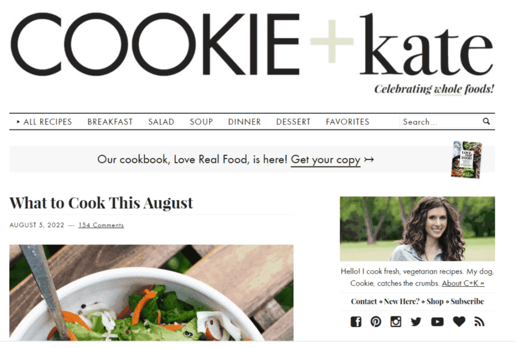
Cookie + Kate is a food recipe blog sharing different cuisines and meal recipes. The blog owner, Kathryne, aka Kate, has structured her blog mindfully, utilizing all the white spaces of her blog well and providing proper navigation. Hence, her visitors find anything and everything on her blog site easily.
She has utilized her sidebar wisely by putting up her picture, a quick link to the about page, her social handles, her Amazon store link, an email newsletter form, and listing popular blog recipes on her site.
The stunning food images you see on her blog are brilliantly captured by her and placed well with her recipe articles. It’s also worth noting that she has learned to cook and take photographs all by herself.
2. Tiny Buddha
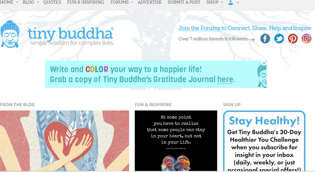
Tiny Buddha is a popular blog about self-help, healing, wisdom, and much more. This blog is well-designed in terms of navigation. The screenshot shows that the top navbar has many tabs to redirect you to the inner pages.
The banner has the social media icons tagged. Scrolling down the site will show you two core things Tiny Buddha offers: a blog and a quote, along with a sign-up opt-in box.
They have utilized their blog white space by showcasing the blog thumbnails, a course video, and their products, and in that space, they have cleverly placed advertisements that do not look like an advertisement at first glance.
3. YogiApproved
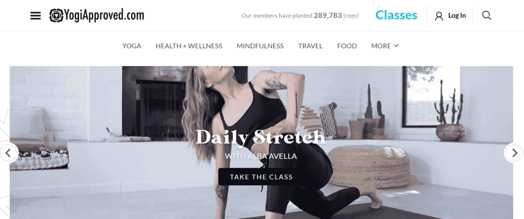
YogiApproved is a fitness and wellness blog that has a stylish blog layout. At the top, they have done the navigating portion nicely.
As the blog’s name suggests, the site is passionate about yoga. They also teach yoga classes, highlighted at the top of the site, right on the banner, and you also get to learn about the yoga classes as you scroll down the site.
When you scroll down the site, you will see blog titles and blog thumbnails using beautiful, high-quality images.
You will see posts showcased as the latest, popular, general, etc., written on various topics. They also highlight their classes once again at the bottom of the blog.
In between the blogs and classes, the advertisements are correctly placed. They advertise their classes on the blog along with other ads.
YogiApproved also has a mobile application available. The download button is placed at the bottom of the site. You can find their social handles down below on the site.
4. TedBlog
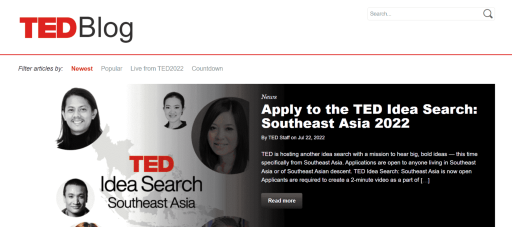
TedBlog has a minimalist, professional, well-organized blog interface.
TedBlog writes about the latest news, updates, and events happening at Ted and in the world. The website opens with a banner image that displays the latest or most important news they have to share.
The blog has minimal content. Even a kid can navigate through the site. It has a quick search button at the top. You can filter your search at the top of the banner based on the newest, popular, and live Ted events and countdown articles.
When you scroll down the site, you will see the list of blogs uploaded, showing blog thumbnails, blog titles, and a short description of what the blog is about.
Along with the signup form, they use their sidebar to display social media icons for visitors to follow. They have also subtly used their sidebar to display advertisements.
5. Copyblogger
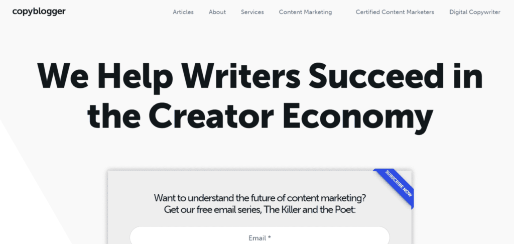
A blog for writers, sharing tools and tips for better writing. You will often see blog layouts either horizontally or vertically. But Copyblogger places their blogs both ways, making the look of the blog smart, clutter-free, and premium.
The menu tabs navigate to different sections of the site. Their banner starts with their purpose along with an email newsletter opt-in.
They do not use a blog image thumbnail but highlight their blog title, which does the job.
6. Teachable
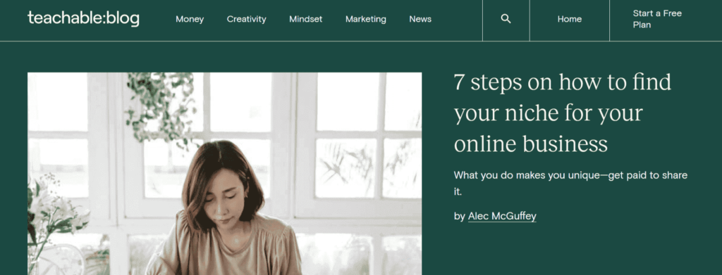
Our next example in this list is the Teachable blog. Teachable is an online course creation platform that helps entrepreneurs create and publish courses or one-on-one coaching for their students.
Teachable has a blog page about advice, suggestions, tips, and tools to help creators create and market their courses.
The blog layout starts with a title bar containing the Teachable logo, blog category tabs, search icon, and home page button, and since it aims at selling their plans, they have placed the call to action in the title bar, making it visible.
Scrolling down, the entire blog is designed with Teachable’s branding color. Then you see blog links with blog titles in a large font placed vertically. They also have a section for popular blogs set up horizontally. You can look for blogs by category.
They list email newsletter opt-in forms and social media handles at the bottom of the site. All over their blog, you will see stunning, good-quality images and good use of brand colors.
7. Mailjet
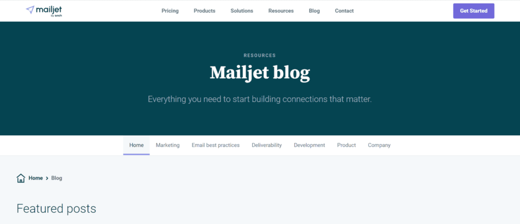
Mailjet is a popular email marketing solution provider. If your website is not a dedicated blog site, and you are a product or service provider looking for blog site layout examples for your blog page, Mailjet’s blog may interest you.
The page starts with a banner stating that it’s the Mailjet blog page. You get seven blog categories below the banner, including the home tab. Visitors can quickly jump into different categories according to the content type they are looking for.
Scrolling through the blog page, you will see many featured blog posts with artistic thumbnails, blog titles, and blog descriptions.
You will find the latest blog posts below the featured blog posts. You get an opt-in form between the sections to subscribe to their mailing list.
At the bottom of the blog, you will find the sign-up form to subscribe to their plans for their main services.
8. Mashable
Mashable is a popular blogging platform that covers various topics, from entertainment to science. Mashable has outperformed many blogging sites with its banner section layout. A stunning and bold image, the large text catches the visitor’s attention and leaves a very good first impression.
As for the rest of the page layout, they use the sidebar and the pre-banner area to display ads (which is quite irritating) and earn ad revenue.
They have utilized the site space by putting up blog thumbnails, blog descriptions (for the general blog list), and blog titles in bold. They segregate the space by showing the hot topics first, followed by the latest articles, and then the general remainder of the blog topics for that particular category. You also get a search button at the top of the page for a quick search.
9. Gizmodo
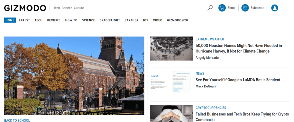
Gizmodo is next on this list. Gizmodo is similar to Mashable: It blogs about science, spaceflight, technology, etc. Since the range of topics is broad, the number of blogs on their website is large.
If your blog has many articles, you can learn how to fit them in without cluttering the blog.
Gizmodo’s blog layout starts with a home page, and right on the side of the home page, they have placed various blog categories for its readers to choose from.
They have used every possible space on their blog site to place all their content, including adding opt-in forms and social handles, in a very organized manner without cluttering any sections.
10. Blogilates
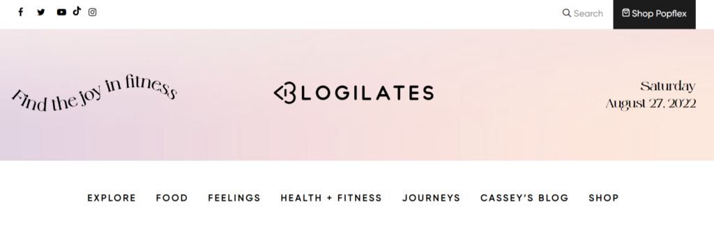
Blogilates is the personal blogging platform of popular fitness YouTuber Cassey Ho, who says she is on a mission to share and spread the joy of fitness. How popular is Cassey? The answer is 7.05 million subscribers.
I love her blog layout. Her brand colors give her blog an elegant look. Cassey writes about food, fitness, and feelings; she shares workout tutorial videos; she sells fitness outfits; she puts up ads, and she also has readers’ comments enabled on her blogs. Despite having many elements on the site, it is not messy. It does look full but not cluttered. Her website and page speed are both fast.
Another element I like in her blog is the date displayed on the banner image. Visit her site, and you will know what I am talking about.
11.November Five
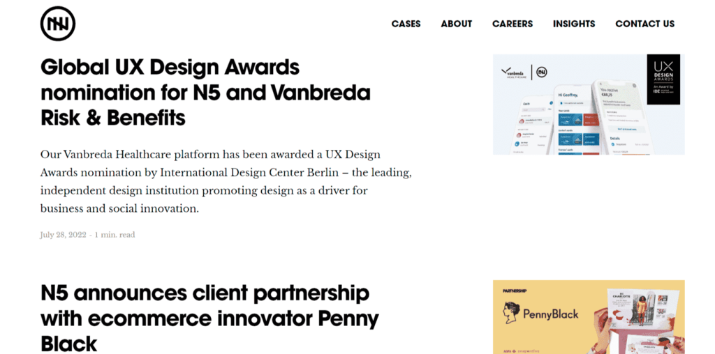
The last blog layout example we have is November Five. It is a digital venture that removes obstacles that stop businesses from achieving their desired results.
The blog page of this site is set up quite simply yet stunningly. Their bold titles and simple fonts give the site a minimalist look.
I also love how they have kept their blog images far from the blog title and snippet. They avoid using the traditional approach.
Visit their page and look at their articles to see what I mean.
They also have a page called “Cases,” where they share their clients’ business cases they have worked on, the challenges the client was facing, and how they came up with a resolution. I loved the whole layout of that page as well.
Conclusion
That is all for today’s post. I hope this article has helped you understand what you need to do for your blog site.